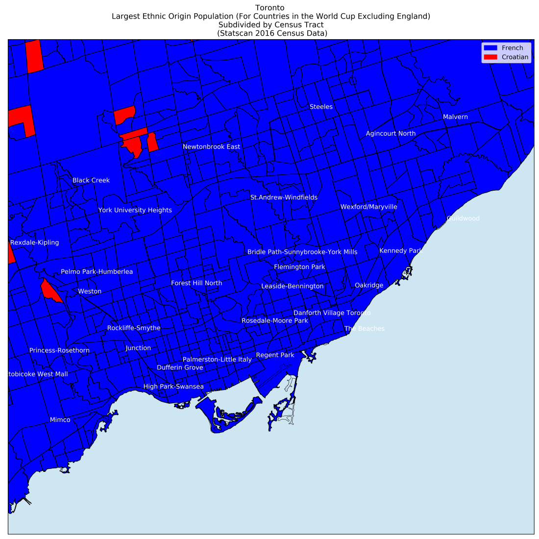
A follow-up to my earlier data visualization (World Cup 2018 – Who is Toronto Cheering For?).
Blue represents census tracts where the French population outnumbers the Croatian population. Red represents census tracts where the Croatian population outnumbers the French population.
